ShopDreamUp AI ArtDreamUp
Deviation Actions


Suggested Deviants


![[BOOK] Read Online About Face The Essentials of In](https://images-wixmp-ed30a86b8c4ca887773594c2.wixmp.com/f/efc04695-00f7-440f-898f-94b4153ee057/dgmjolh-431d98a0-cf4f-43c0-8e27-94a6724ee866.jpg/v1/crop/w_184,h_184,x_0,y_35,scl_0.25240054869684,q_70,strp/_book__read_online_about_face_the_essentials_of_in_by_keinnagrethania_dgmjolh-92s-2x.jpg?token=eyJ0eXAiOiJKV1QiLCJhbGciOiJIUzI1NiJ9.eyJzdWIiOiJ1cm46YXBwOjdlMGQxODg5ODIyNjQzNzNhNWYwZDQxNWVhMGQyNmUwIiwiaXNzIjoidXJuOmFwcDo3ZTBkMTg4OTgyMjY0MzczYTVmMGQ0MTVlYTBkMjZlMCIsIm9iaiI6W1t7ImhlaWdodCI6Ijw9MTI4MCIsInBhdGgiOiJcL2ZcL2VmYzA0Njk1LTAwZjctNDQwZi04OThmLTk0YjQxNTNlZTA1N1wvZGdtam9saC00MzFkOThhMC1jZjRmLTQzYzAtOGUyNy05NGE2NzI0ZWU4NjYuanBnIiwid2lkdGgiOiI8PTcyOSJ9XV0sImF1ZCI6WyJ1cm46c2VydmljZTppbWFnZS5vcGVyYXRpb25zIl19.HhCnLgLu732KIyOnlyyFwXKdi9cmjt5bmV-QhHUhioI)
![[BOOK] Read Online About Face The Essentials of In](https://images-wixmp-ed30a86b8c4ca887773594c2.wixmp.com/f/efc04695-00f7-440f-898f-94b4153ee057/dgmjolh-431d98a0-cf4f-43c0-8e27-94a6724ee866.jpg/v1/crop/w_92,h_92,x_0,y_17,scl_0.12620027434842,q_70,strp/_book__read_online_about_face_the_essentials_of_in_by_keinnagrethania_dgmjolh-92s.jpg?token=eyJ0eXAiOiJKV1QiLCJhbGciOiJIUzI1NiJ9.eyJzdWIiOiJ1cm46YXBwOjdlMGQxODg5ODIyNjQzNzNhNWYwZDQxNWVhMGQyNmUwIiwiaXNzIjoidXJuOmFwcDo3ZTBkMTg4OTgyMjY0MzczYTVmMGQ0MTVlYTBkMjZlMCIsIm9iaiI6W1t7ImhlaWdodCI6Ijw9MTI4MCIsInBhdGgiOiJcL2ZcL2VmYzA0Njk1LTAwZjctNDQwZi04OThmLTk0YjQxNTNlZTA1N1wvZGdtam9saC00MzFkOThhMC1jZjRmLTQzYzAtOGUyNy05NGE2NzI0ZWU4NjYuanBnIiwid2lkdGgiOiI8PTcyOSJ9XV0sImF1ZCI6WyJ1cm46c2VydmljZTppbWFnZS5vcGVyYXRpb25zIl19.HhCnLgLu732KIyOnlyyFwXKdi9cmjt5bmV-QhHUhioI)
![[Read Download] [PDF] Alfreds Basic Piano Prep Co](https://images-wixmp-ed30a86b8c4ca887773594c2.wixmp.com/f/efc04695-00f7-440f-898f-94b4153ee057/dgmjn8z-815c8924-5af9-4d17-9eeb-dc18d7d5e9ac.jpg/v1/crop/w_184,h_184,x_0,y_35,scl_0.25240054869684,q_70,strp/_read__download___pdf__alfreds_basic_piano_prep_co_by_keinnagrethania_dgmjn8z-92s-2x.jpg?token=eyJ0eXAiOiJKV1QiLCJhbGciOiJIUzI1NiJ9.eyJzdWIiOiJ1cm46YXBwOjdlMGQxODg5ODIyNjQzNzNhNWYwZDQxNWVhMGQyNmUwIiwiaXNzIjoidXJuOmFwcDo3ZTBkMTg4OTgyMjY0MzczYTVmMGQ0MTVlYTBkMjZlMCIsIm9iaiI6W1t7ImhlaWdodCI6Ijw9MTI4MCIsInBhdGgiOiJcL2ZcL2VmYzA0Njk1LTAwZjctNDQwZi04OThmLTk0YjQxNTNlZTA1N1wvZGdtam44ei04MTVjODkyNC01YWY5LTRkMTctOWVlYi1kYzE4ZDdkNWU5YWMuanBnIiwid2lkdGgiOiI8PTcyOSJ9XV0sImF1ZCI6WyJ1cm46c2VydmljZTppbWFnZS5vcGVyYXRpb25zIl19.gZQzBwFZ5Ch2dEvlCtqHCSgijjl0qi_RnjEj1GaEEF8)
![[Read Download] [PDF] Alfreds Basic Piano Prep Co](https://images-wixmp-ed30a86b8c4ca887773594c2.wixmp.com/f/efc04695-00f7-440f-898f-94b4153ee057/dgmjn8z-815c8924-5af9-4d17-9eeb-dc18d7d5e9ac.jpg/v1/crop/w_92,h_92,x_0,y_17,scl_0.12620027434842,q_70,strp/_read__download___pdf__alfreds_basic_piano_prep_co_by_keinnagrethania_dgmjn8z-92s.jpg?token=eyJ0eXAiOiJKV1QiLCJhbGciOiJIUzI1NiJ9.eyJzdWIiOiJ1cm46YXBwOjdlMGQxODg5ODIyNjQzNzNhNWYwZDQxNWVhMGQyNmUwIiwiaXNzIjoidXJuOmFwcDo3ZTBkMTg4OTgyMjY0MzczYTVmMGQ0MTVlYTBkMjZlMCIsIm9iaiI6W1t7ImhlaWdodCI6Ijw9MTI4MCIsInBhdGgiOiJcL2ZcL2VmYzA0Njk1LTAwZjctNDQwZi04OThmLTk0YjQxNTNlZTA1N1wvZGdtam44ei04MTVjODkyNC01YWY5LTRkMTctOWVlYi1kYzE4ZDdkNWU5YWMuanBnIiwid2lkdGgiOiI8PTcyOSJ9XV0sImF1ZCI6WyJ1cm46c2VydmljZTppbWFnZS5vcGVyYXRpb25zIl19.gZQzBwFZ5Ch2dEvlCtqHCSgijjl0qi_RnjEj1GaEEF8)
![[Read Download] [PDF] Linked Conquer LinkedIn. Ge](https://images-wixmp-ed30a86b8c4ca887773594c2.wixmp.com/f/efc04695-00f7-440f-898f-94b4153ee057/dgmjmlw-c2b70536-d993-4cf5-95c1-89b7d3973920.jpg/v1/crop/w_184,h_184,x_0,y_35,scl_0.25240054869684,q_70,strp/_read__download___pdf__linked_conquer_linkedin__ge_by_keinnagrethania_dgmjmlw-92s-2x.jpg?token=eyJ0eXAiOiJKV1QiLCJhbGciOiJIUzI1NiJ9.eyJzdWIiOiJ1cm46YXBwOjdlMGQxODg5ODIyNjQzNzNhNWYwZDQxNWVhMGQyNmUwIiwiaXNzIjoidXJuOmFwcDo3ZTBkMTg4OTgyMjY0MzczYTVmMGQ0MTVlYTBkMjZlMCIsIm9iaiI6W1t7ImhlaWdodCI6Ijw9MTI4MCIsInBhdGgiOiJcL2ZcL2VmYzA0Njk1LTAwZjctNDQwZi04OThmLTk0YjQxNTNlZTA1N1wvZGdtam1sdy1jMmI3MDUzNi1kOTkzLTRjZjUtOTVjMS04OWI3ZDM5NzM5MjAuanBnIiwid2lkdGgiOiI8PTcyOSJ9XV0sImF1ZCI6WyJ1cm46c2VydmljZTppbWFnZS5vcGVyYXRpb25zIl19.4XAr--VL3lbzYpCXytp1zEsp4cMgLDRM0dFvgMEnLKo)
![[Read Download] [PDF] Linked Conquer LinkedIn. Ge](https://images-wixmp-ed30a86b8c4ca887773594c2.wixmp.com/f/efc04695-00f7-440f-898f-94b4153ee057/dgmjmlw-c2b70536-d993-4cf5-95c1-89b7d3973920.jpg/v1/crop/w_92,h_92,x_0,y_17,scl_0.12620027434842,q_70,strp/_read__download___pdf__linked_conquer_linkedin__ge_by_keinnagrethania_dgmjmlw-92s.jpg?token=eyJ0eXAiOiJKV1QiLCJhbGciOiJIUzI1NiJ9.eyJzdWIiOiJ1cm46YXBwOjdlMGQxODg5ODIyNjQzNzNhNWYwZDQxNWVhMGQyNmUwIiwiaXNzIjoidXJuOmFwcDo3ZTBkMTg4OTgyMjY0MzczYTVmMGQ0MTVlYTBkMjZlMCIsIm9iaiI6W1t7ImhlaWdodCI6Ijw9MTI4MCIsInBhdGgiOiJcL2ZcL2VmYzA0Njk1LTAwZjctNDQwZi04OThmLTk0YjQxNTNlZTA1N1wvZGdtam1sdy1jMmI3MDUzNi1kOTkzLTRjZjUtOTVjMS04OWI3ZDM5NzM5MjAuanBnIiwid2lkdGgiOiI8PTcyOSJ9XV0sImF1ZCI6WyJ1cm46c2VydmljZTppbWFnZS5vcGVyYXRpb25zIl19.4XAr--VL3lbzYpCXytp1zEsp4cMgLDRM0dFvgMEnLKo)
Suggested Collections


You Might Like…


Featured in Groups


Description
Hiya! Konichi wa! and stuff.
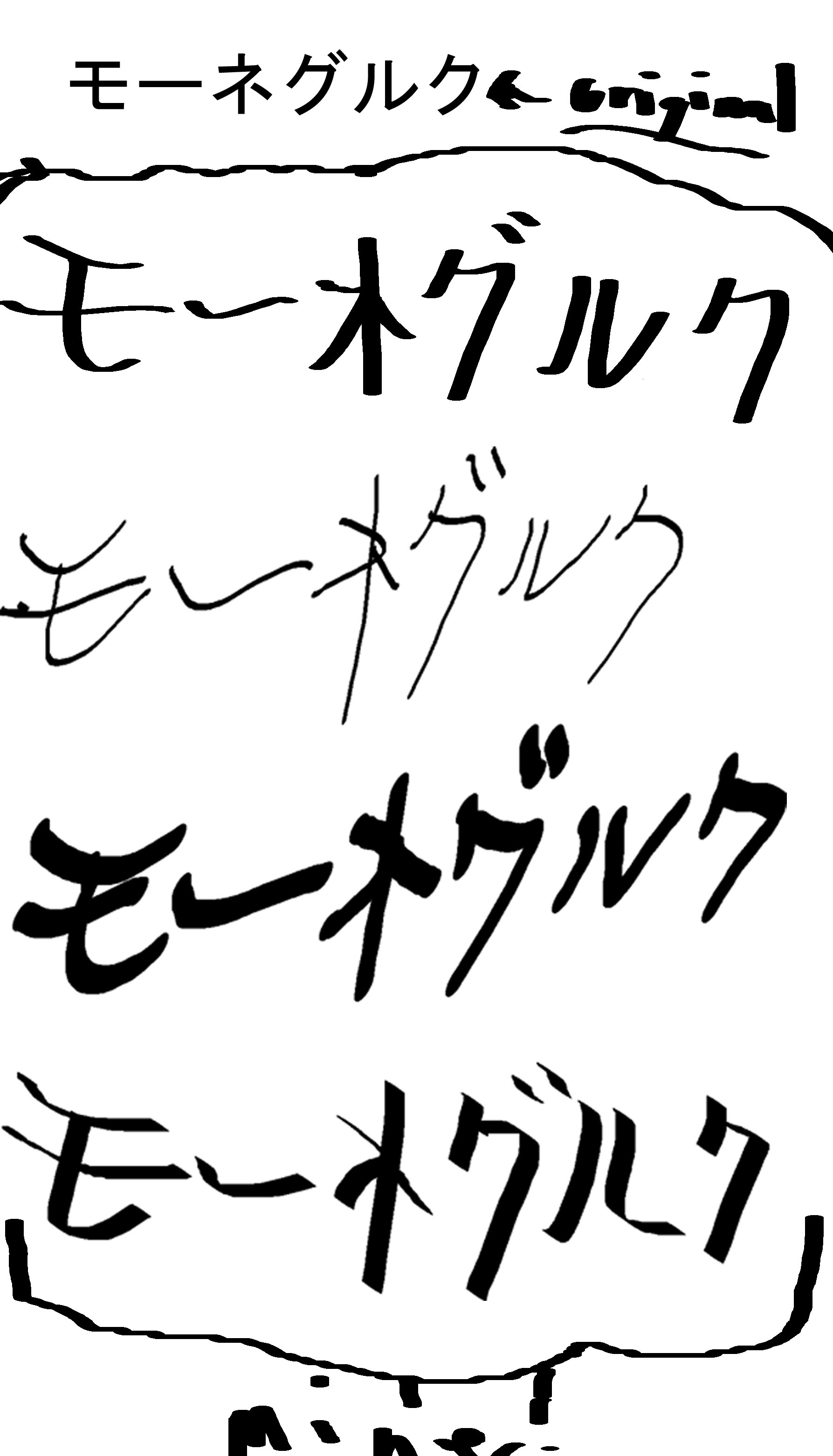
I am currently going to perfect my logo for Moneglk. I will be creating a version in Japanese (primarily because I am using the style and... well it's kind of rude to use a style but not incorprate the culture... yes?) so I will be adding Katakana to the logo.
I will have to change the story a bit, but I won't have to so much (since I found out I was already writing it like it was in feudal Japan) that it won't be the same story anymore. Before actually going for it... I will have to research the history and so forth... but I'm getting to that as I learn the language.
Anyway... these are sketches of the name in katakana... I used a translator and doubled-checked what I had written before actually writing it. I know it's correct. What surprised me was that the Japanese translation pronounced it the exact way I intended!
I'm so happy!
Anyway... if you all would be so kind as to tell me which one would like the most? I can't decide, since I like them all to a degree... The very top one is just typed, but the others are written by hand by me. I know they're a bit sloppy. I meant to make them that way, so I wrote with quick, short strokes.
Let me know which one is your favorite... I'll keep sketching, but so far... these are the best I can muster...
Heh... arigatoo gozaimasu!
Image size
1787x3125px 351.41 KB
© 2012 - 2024 Esvandetta
Comments6
Join the community to add your comment. Already a deviant? Log In
Sounds like fun to study Japanese ")
I prefer the first one (looks harmonious), next comes the third one (looks dynamic/modern, like written with a felt-tip pen)
The second looks just too thin >>to me<< and the last one looks... I dunno, unbalanced >>in my eyes<< xD
Good luck with practicing!!
I prefer the first one (looks harmonious), next comes the third one (looks dynamic/modern, like written with a felt-tip pen)
The second looks just too thin >>to me<< and the last one looks... I dunno, unbalanced >>in my eyes<< xD
Good luck with practicing!!