ShopDreamUp AI ArtDreamUp
Deviation Actions


Suggested Deviants


Suggested Collections


You Might Like…


Description
Hiya...
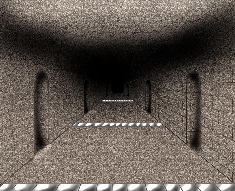
Just a bit of fun. I'm playing around with perspective and I must say it's quite tricky to get it looking good! This is just 1-point, so it's certainly easier than the rest. I'll dabble in 2 and 3 point... but I'm not trying to be serious.
Anyway. Gloomy hallway... no blood (yet)... going down it or not?
Ja ne,
~TLA
Image size
2645x2152px 3.39 MB
© 2011 - 2024 Esvandetta
Comments10
Join the community to add your comment. Already a deviant? Log In
Hello!!! I'm from #FeedbackFrenzy!!!
First of all, the perspective of the walls is well done. We can see them getting further and further away from us convincingly. I... can't say the same for the floor tiles. I can't say you've done them exactly right, especially those in the section in the middle.
I know you said this is perspective practise, but I can spot a couple of things about shadows as well:
while ti makes sense that the door openings would be darker, I see no reason for the floor IN FRONT OF them beeing lighter... That was uneccessary and unrealistic. It looks as if there is some kind of barrier for the light, and anything that steps through the doorstep is swallowed by darkness. The floor INSIDE the openings shouldn't be as dark, some of the outside light should reach in.
Next thing: the shadows on the ceiling. I can see the corners being more shadowy than the rest of the ceiling, but I think this is slightly overdone, at last at the part that is close to us. These shadows could be a little narrower and more defined. We are close, so we can see them clearly.
One final thing that annoys me: the black line on the top of the right wall, right underneath the shadows. It gives me the impression that the corner between ceiling at wall is right there (but I doubt that's the case sinse the shadows are elsewere). I can see that the same line is not as prominent at the left side, so I suppose you didn't do it in purpose. Anyway, there is no reason for it to stand out so much....
All in all, I think your practice is going well!! ^^ The bricks, that must have been very hard, are made correctly!! So keep up with the hard work!!! (Smile)")
First of all, the perspective of the walls is well done. We can see them getting further and further away from us convincingly. I... can't say the same for the floor tiles. I can't say you've done them exactly right, especially those in the section in the middle.
I know you said this is perspective practise, but I can spot a couple of things about shadows as well:
while ti makes sense that the door openings would be darker, I see no reason for the floor IN FRONT OF them beeing lighter... That was uneccessary and unrealistic. It looks as if there is some kind of barrier for the light, and anything that steps through the doorstep is swallowed by darkness. The floor INSIDE the openings shouldn't be as dark, some of the outside light should reach in.
Next thing: the shadows on the ceiling. I can see the corners being more shadowy than the rest of the ceiling, but I think this is slightly overdone, at last at the part that is close to us. These shadows could be a little narrower and more defined. We are close, so we can see them clearly.
One final thing that annoys me: the black line on the top of the right wall, right underneath the shadows. It gives me the impression that the corner between ceiling at wall is right there (but I doubt that's the case sinse the shadows are elsewere). I can see that the same line is not as prominent at the left side, so I suppose you didn't do it in purpose. Anyway, there is no reason for it to stand out so much....
All in all, I think your practice is going well!! ^^ The bricks, that must have been very hard, are made correctly!! So keep up with the hard work!!!